1200 GRID SYSTEM

15 COLUMN GRID

WHAT IS IT?

The 15 column grid is divided into portions that are 60 pixels wide. Each column has 10 pixels of margin on the left and right, which create 20 pixel wide gutters between columns and a 10 pixel column on either side of the page's body.

Think of it like our roads and traffic laws. They are put in place for our safety and make giving directions much easier than "go past 47 hills then turn right at the big rock and a red house." We can still drive whatever car we want, can choose from many alternate routes, listen to music, and drive many speeds as long as they are under the legal limit.

This is a system that was developed to make designing easier and faster. It uses CSS code to control the html elements. With the set column widths, there is less randomness in design, requiring less math, less decisions, and more accuracy.
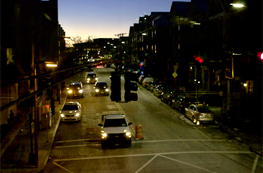
traffic stopped at light

Doesn't it restrict your design?

HECK NO!

Think about it. There are no restrictions on anything except your total pixel size for the page. You are not forced to adhere to the columns. Regular CSS can still easily be used to add margins or padding using whateever random pixel count you need.